DATA VISUALIZATION
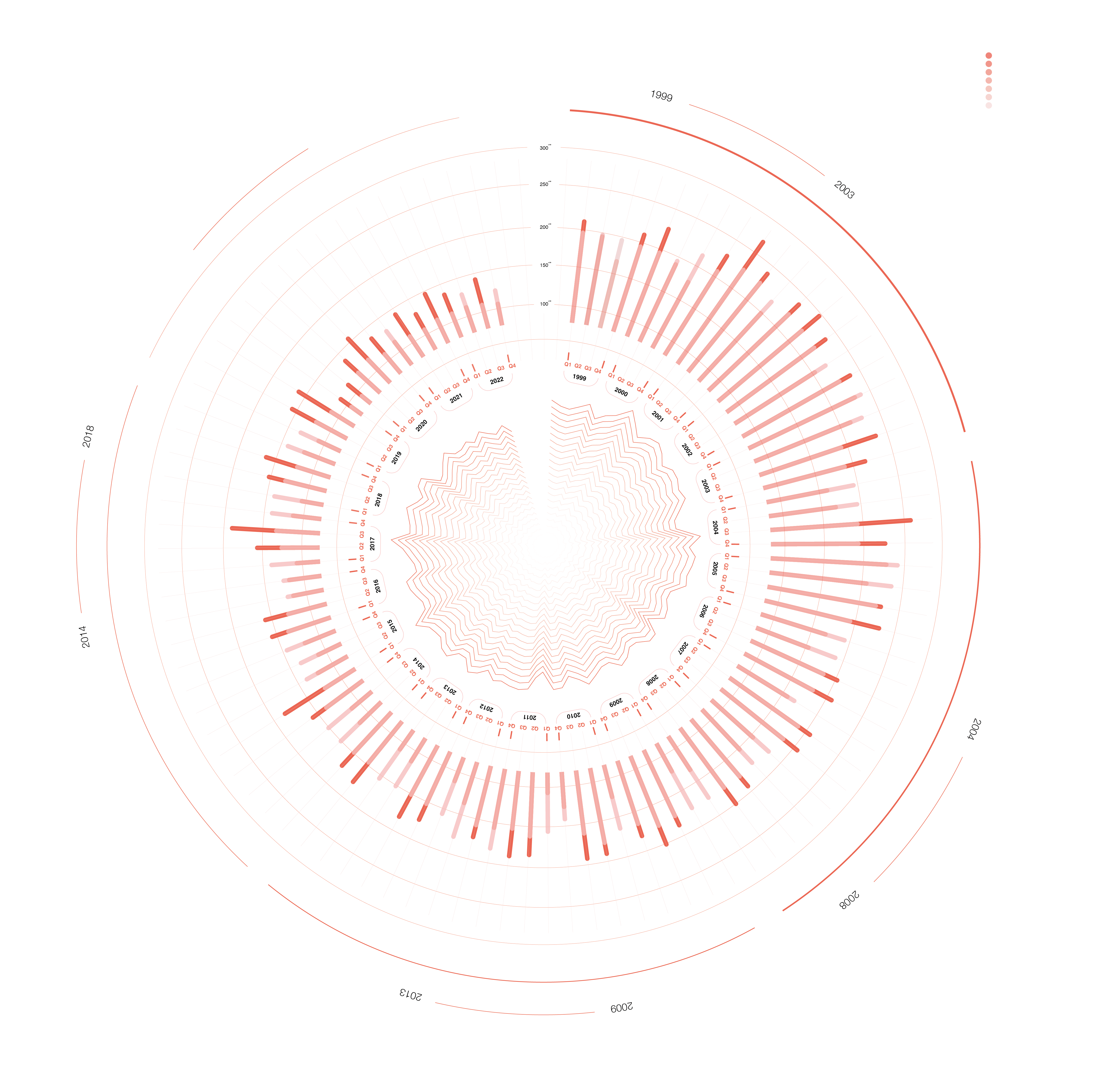
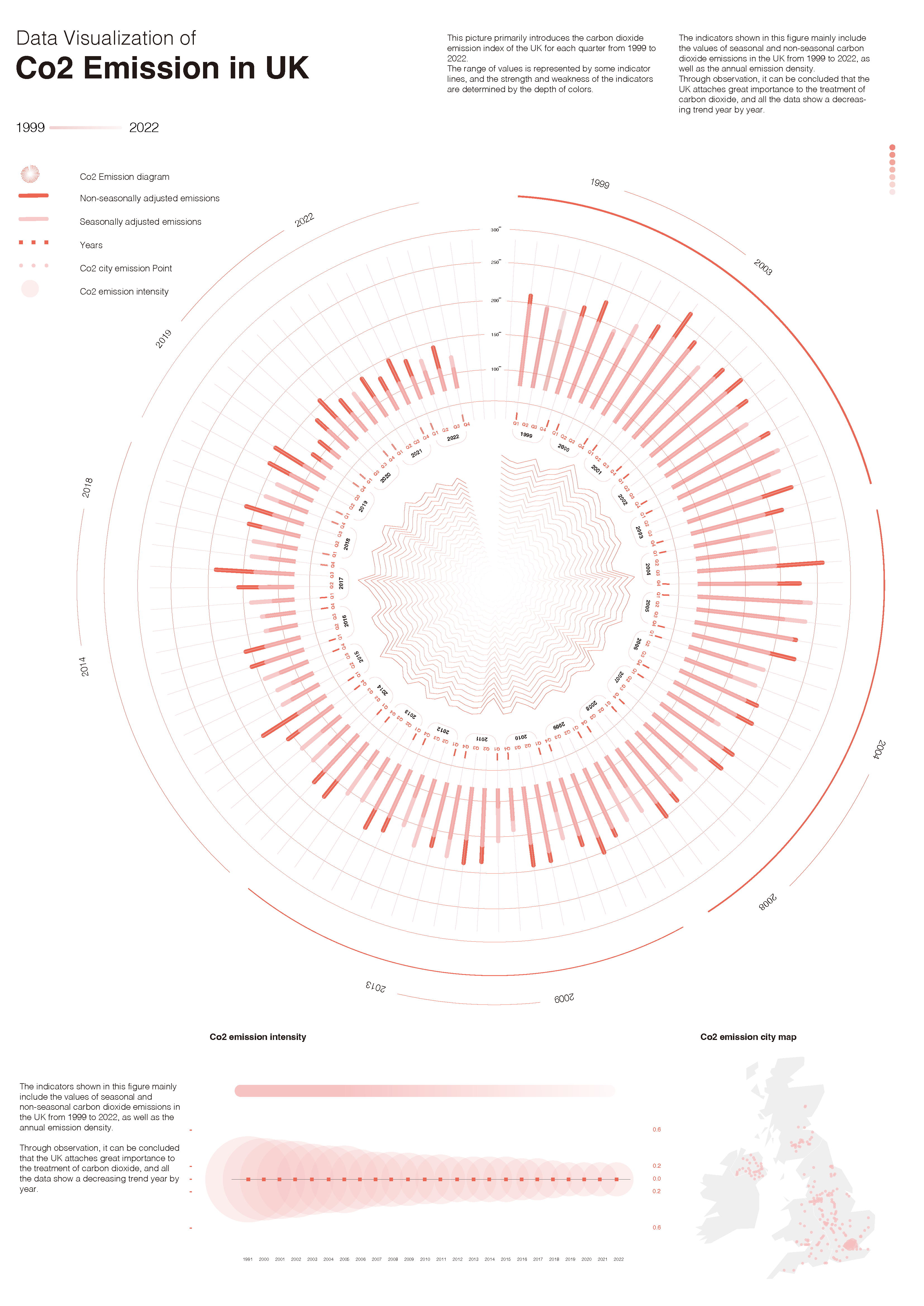
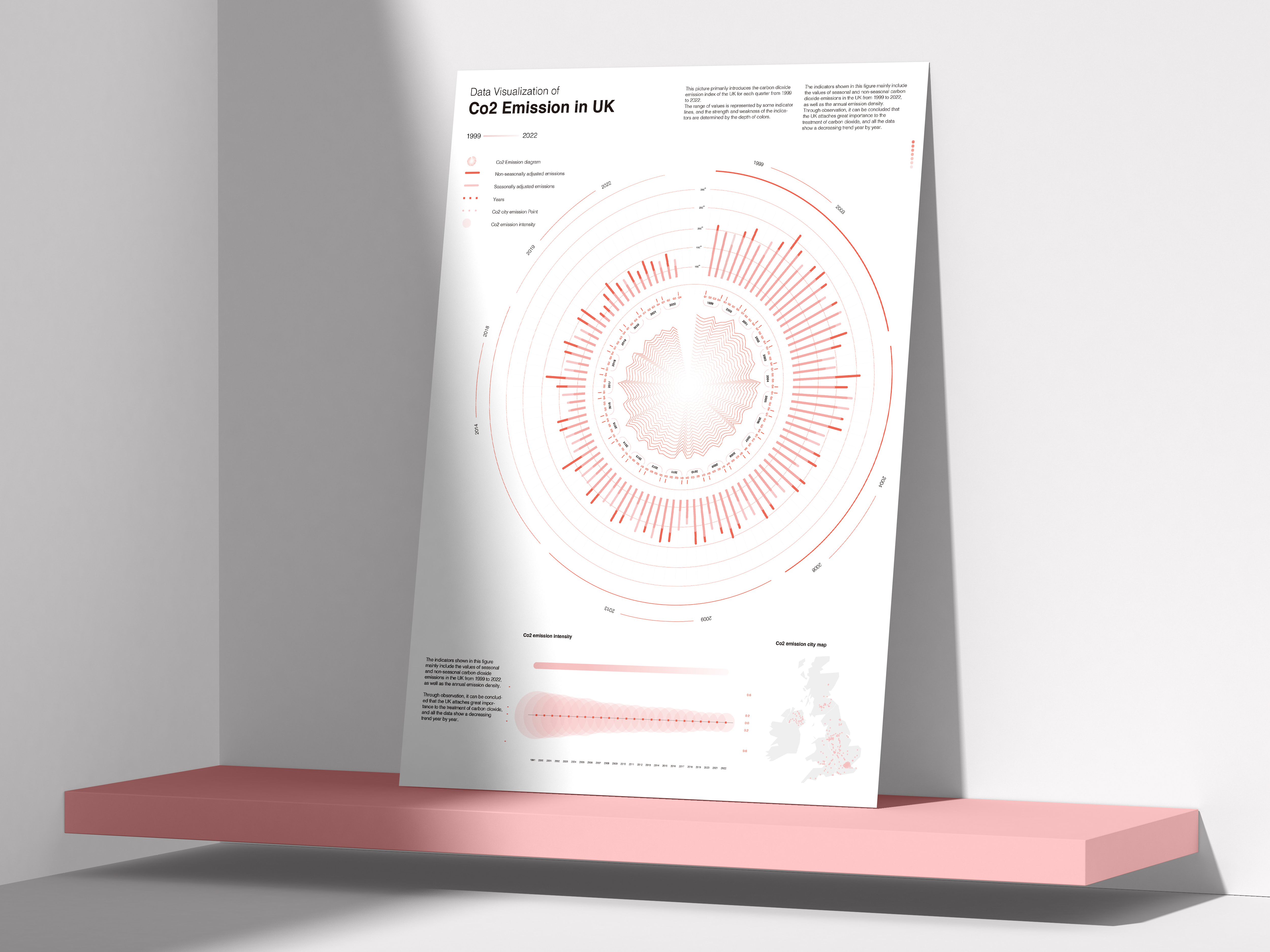
CO2 emissions data for London between 1999 and 2022 were visualized and vector illustrations were used to show the emission values for each year.
The CO2 concentration is represented by a gradient of colors (dark to light), with darker colors representing higher emissions and lighter colors representing lower emissions.
信息可视化
将伦敦1999年至2022年间的二氧化碳排放数据进行可视化处理,并使用矢量插图展示各年份的排放数值。
通过颜色的渐变(由深到浅)表示二氧化碳的浓度,深色代表较高的排放量,浅色代表较低的排放量。
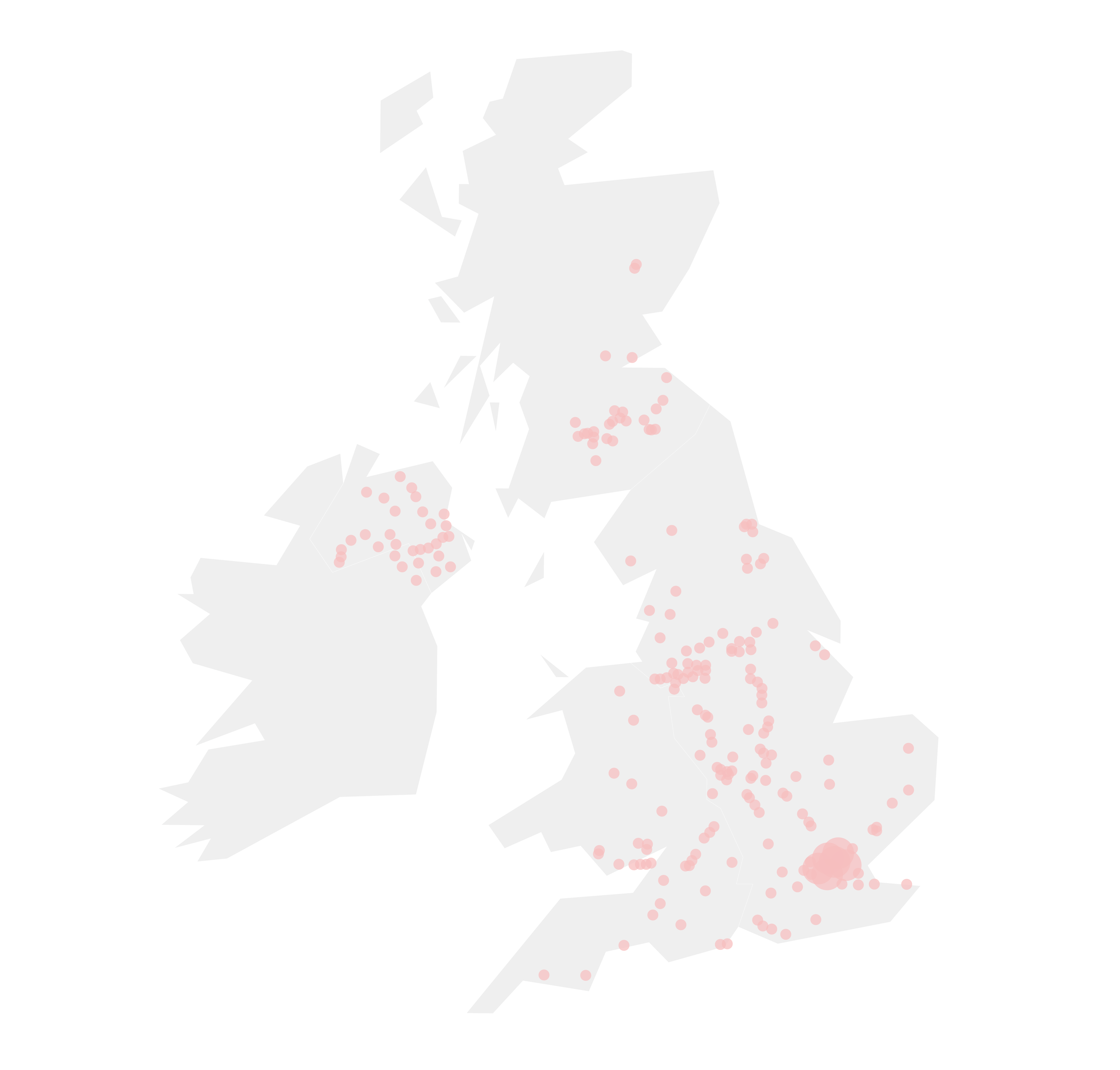
Regional Distribution / 地区分布

Data Cycle / 数据周期

Emission index / 排放指数


@LIN JIE 2024
All rights reserved